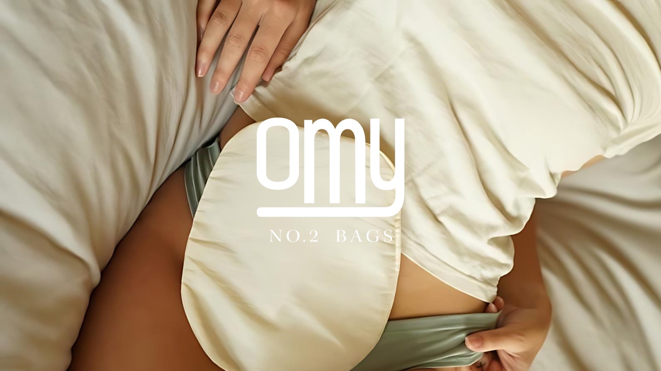
/PROJECT/ Brand Identity
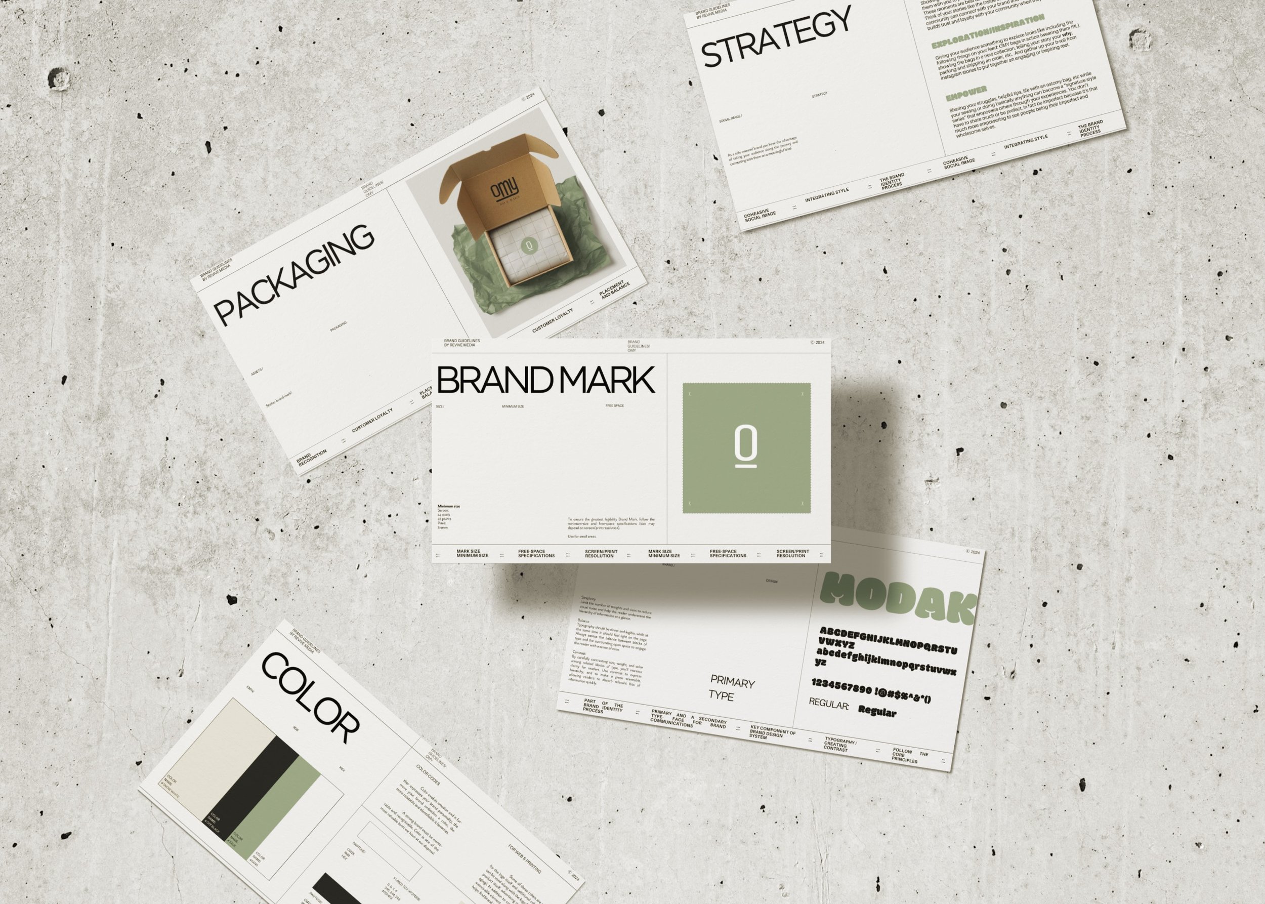
/DELIVERABLES/ Essential Package + Package design, card design, platform implementation
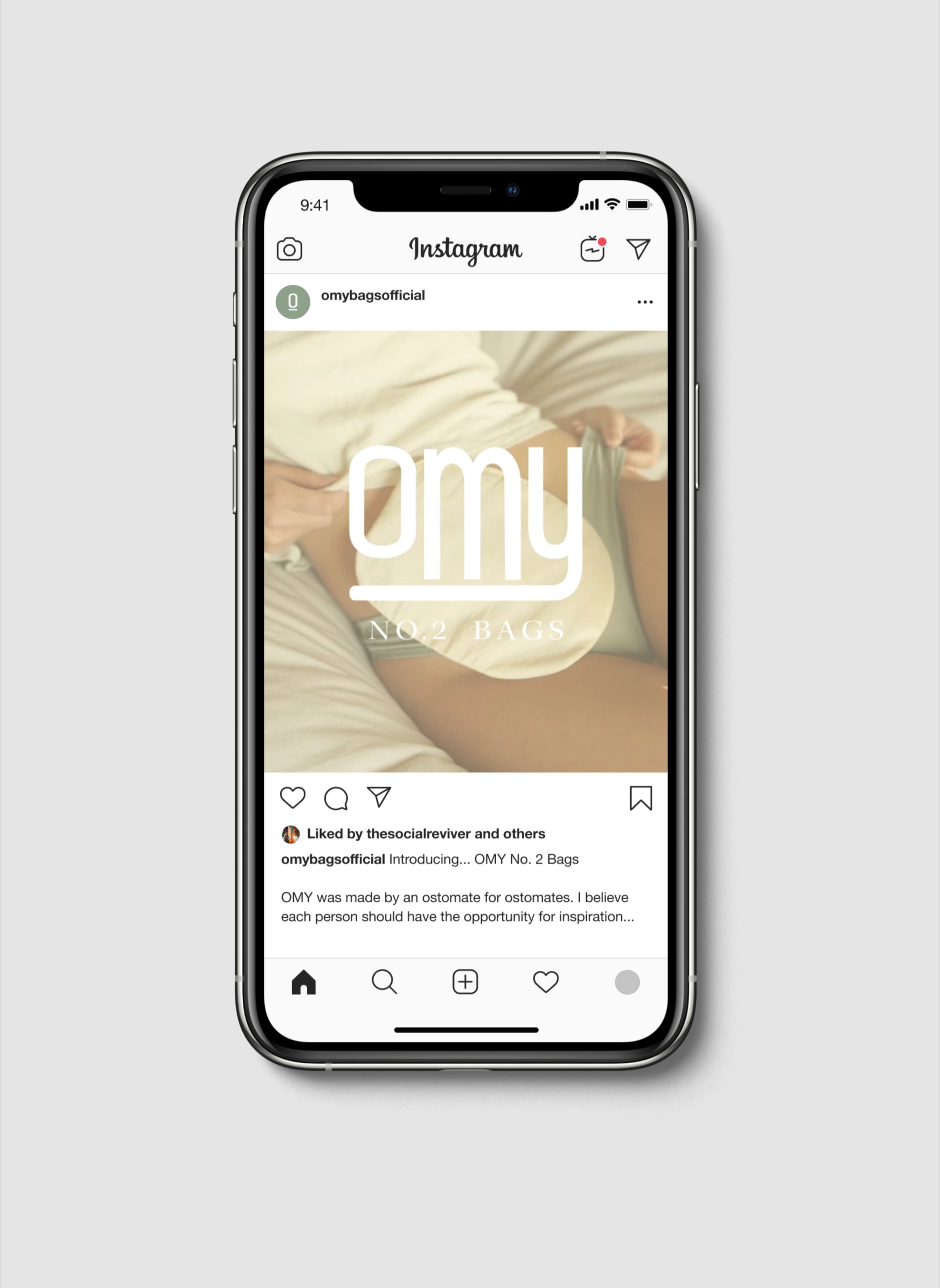
/KEYWORDS/ Sustainable, Stylish, Imperfect, Handmade
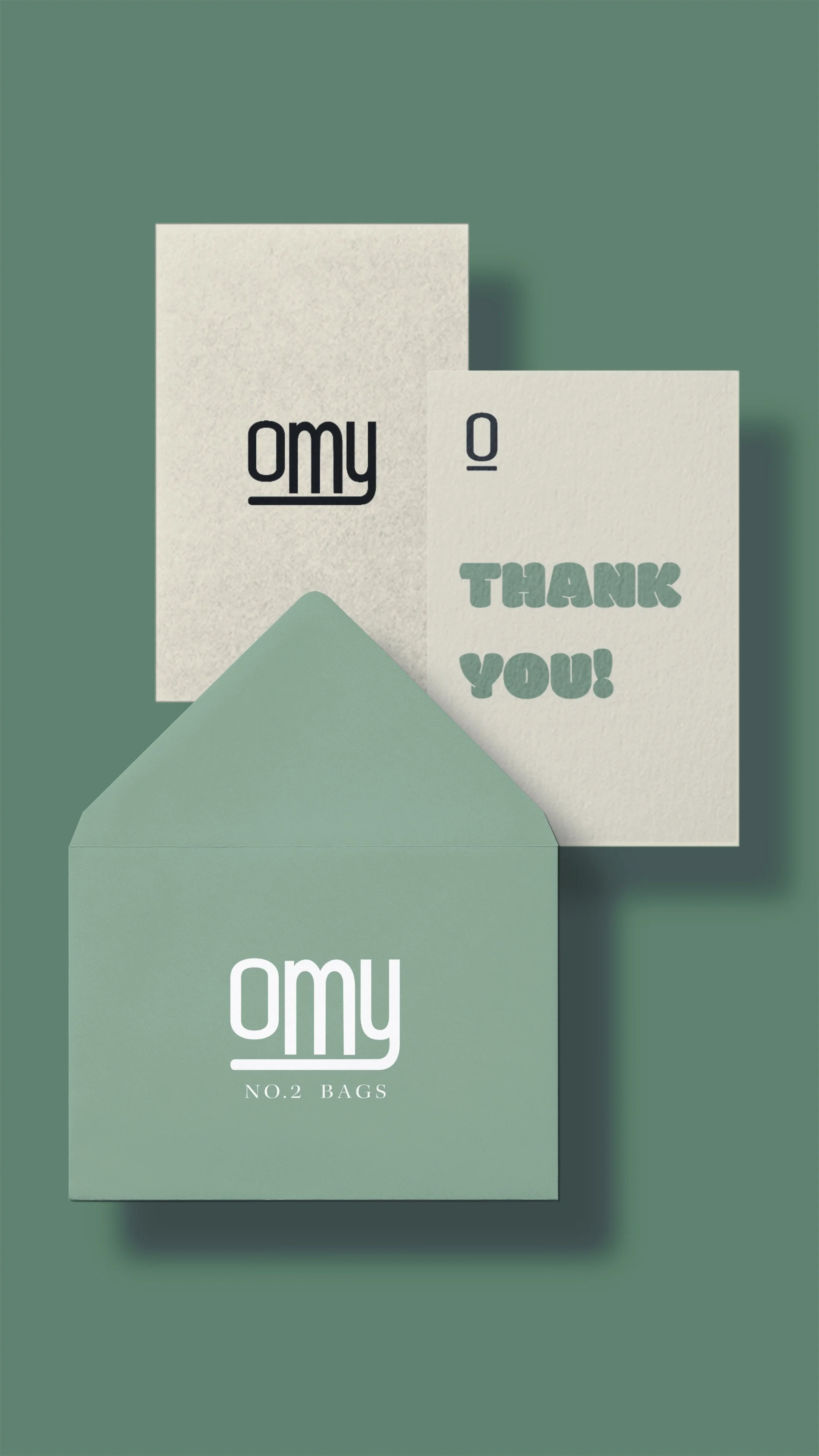
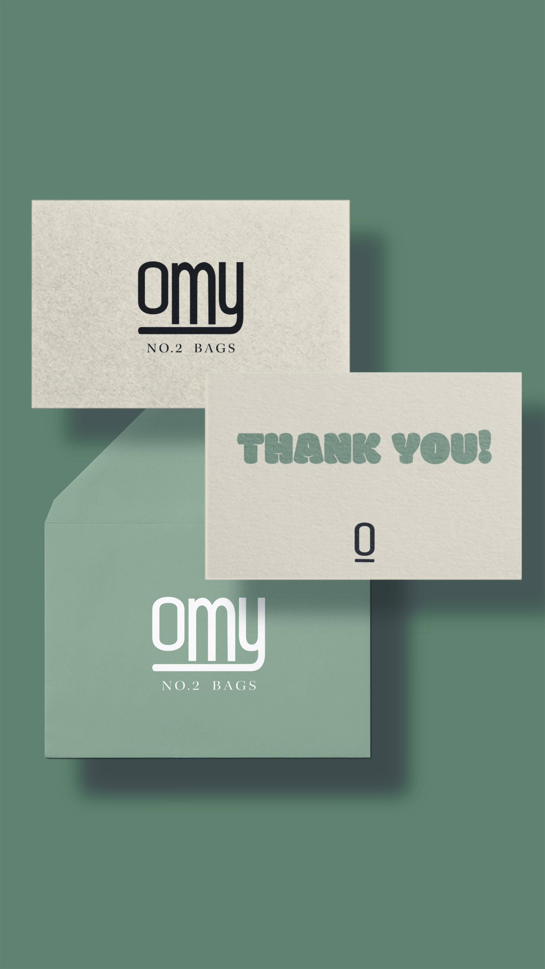
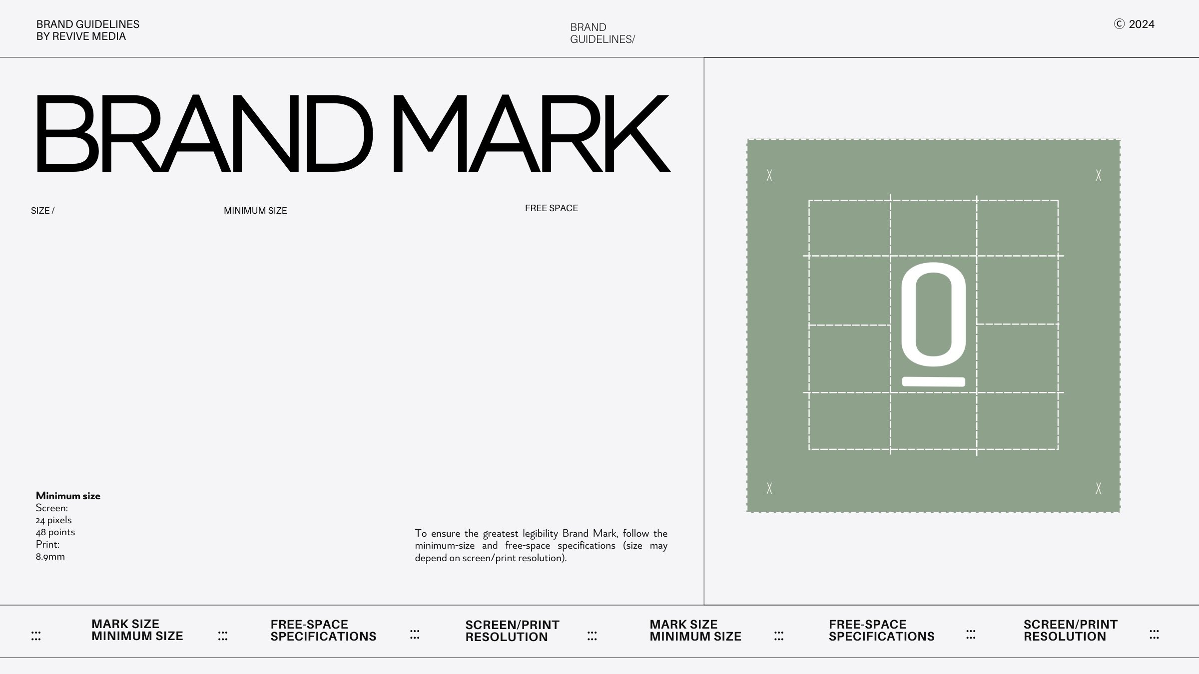
Logo Story

Consistent curves soften the brand, creating approachability while following an ostomy bag’s rounded edges. For an imperfect touch and visual balance, the ‘O’ and ‘Y’ curve in alignment while the ‘M’ extends beyond their curves.

The brand mark itself resembles an ostomy bag. The ‘O’ is congruent to the shape of a bag and bag cover, while the line represents where the bag opens.